Horror movie trivia

Creating a Movie Trivia Book

This project started with a whole lot of research and photo gathering. Staying consistent throughout the spreads was difficult until I found a layout that I really liked and was able to stick to.

Guidelines For The Project
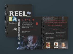
Cover Design:
Create an eye-catching cover that reflects the theme and content of the book. The cover should entice readers and provide a glimpse into the book’s focus on movie trivia.

Table of Contents:
Design a table of unique contents.

Chapters on Different Films:
Develop five chapters, each dedicated to a different film.
Each chapter must include the film’s title, release year, director, other films by the director, top three actors, a pull quote, and at least five trivia facts.

Individual Trivia Fact Designs:
Create 5 to 10 individual designs, each illustrating a different movie trivia fact.

High-Resolution Images:
Incorporate high-resolution images throughout the book to support and enhance the trivia facts.


Pull quotes: Each film should have a stunning typographic pull-quote design from the film.me for my book and I settled on my favorite movie genre- horror.

Step 1: Gathering Research

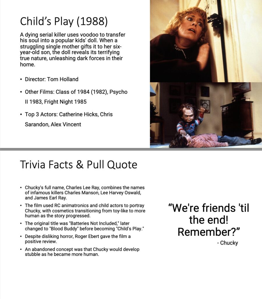
With the help of IMDB (Internet Movie Database) I was able to gather all components needed for me to successfully create this piece such as: trivia facts, photos, pull quotes and summaries. Of course, it wouldn’t remain this easy. To refrain from plagiarism issues, I reworded and rephrased the trivia facts and summaries that I had retrieved; the pull quotes however stayed the same, for more or less obvious reasons. I organized all of this information and assets into one long powerpoint file in which I was able to reference when designing my booklet in InDesign.

Step 2: Deciding on a Layout

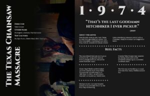
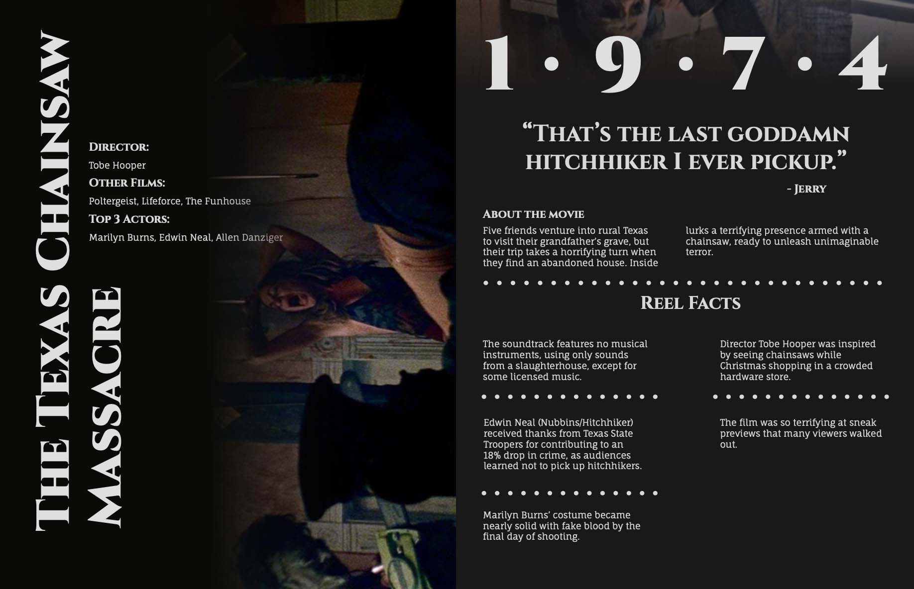
Version 1

I had to come up with an idea/plan for what I wanted my booklet to look like. I knew I wanted an asymmetrical layout for the title page. I also wanted to show clear hierarchy. On the right page however, I wanted a very straightforward, consistent layout. This was my initial design plan.

After sending the design to some of my peers, I received great feedback. Some of the recommendations that I got were to put the date on the left page, introduce more colors and evenly fill out the right page.

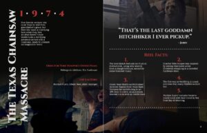
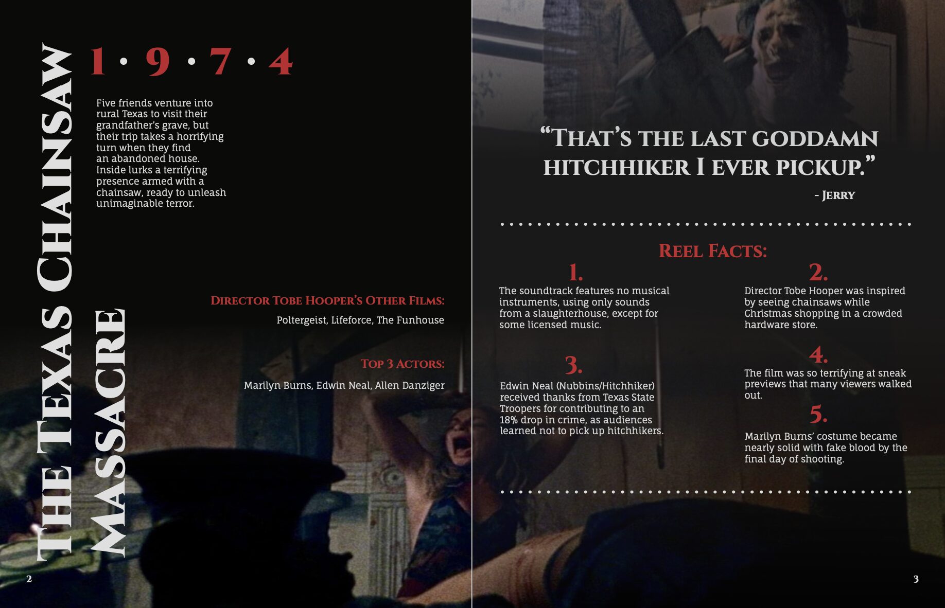
Version 2

After taking the recommendations into consideration, this is the design layout that I had settled on. I believed that this design was both more eye-catching/interested and what I was really looking for in my piece. However, something still felt a little off to me about the design, so I decided to look at the piece with fresh eyes.

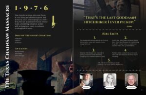
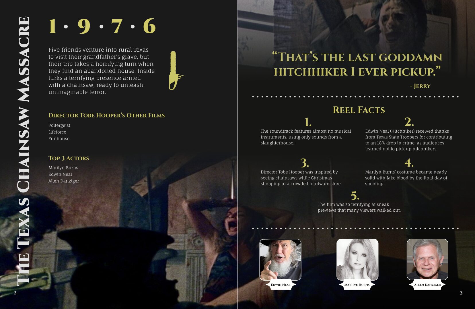
Final Version

After another round of revisions, I ultimately decided on this layout and design choices. I chose to keep the titles of the movies in one line, with the year, summary, and director & actor information on the left page. I chose to color the quote the same color as the accent color on the other page and to fill some space at the bottom I decided to show photos of the actual actors.

Step 3: Finishing The Book

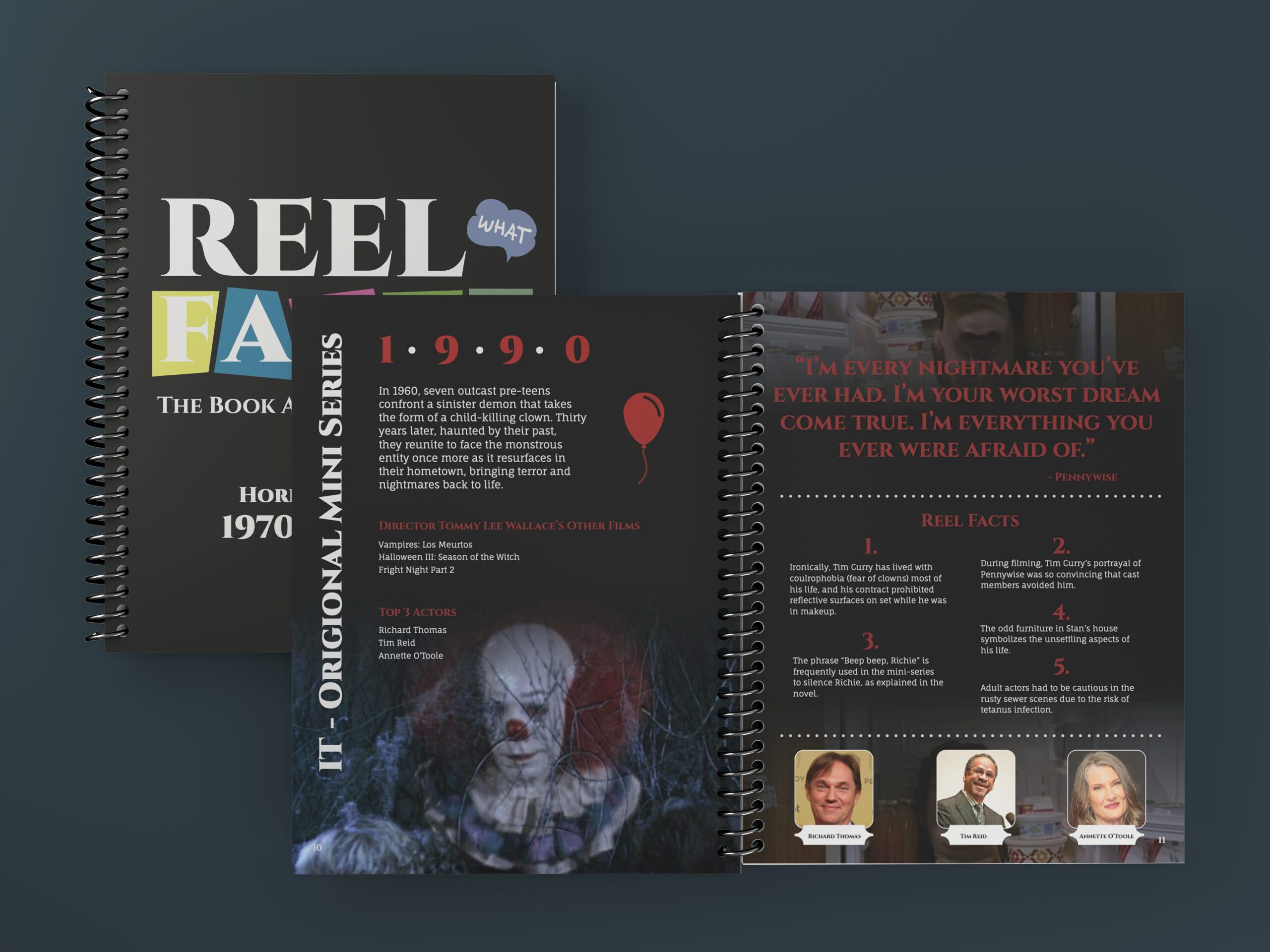
Take a look at the final product here

Reflecting: Workflow Timeline

Week One

Week one was spent picking out which movies from each decade that I would want in my final piece. During this week I also created the summaries and found the high quality images that I would want to use.

Week Two

Week two was spent finding all of the additional information needed to complete he project criteria such as the director, the top three actors, the directors other films, the trivia facts and the pull quotes as well as who said them.

Week Three

Week three was spent setting up my InDesign file and trial and erroring different layouts that I would like to have. Once I settled on a peer approved, as well favorite layout of my own, I set my paragraph styles, object styles and page numbers. During this week, I also loosely laid out the remainder of my pages for tidying up later.

Week Four

Week four was spent getting a class critique and adjusting my design choices based on the feedback. I connected any lose ends in my design and ensured that all of my spreads were perfect before submitting the final piece.

Week Five

Week five is where the magic happened, I created my table of contents page as well as cover page and later in the week I printed out my booklet, trimmed it and bound it together with a spiral binding.

Challenges

Some of the challenges that I had came across were the following:

Figuring out how to display the trivia facts appealingly
Deciding how to incorporate an asymmetrical design
Configuring interesting and appealing background content

Solutions

Here are the solutions that I came up with to address the challenges:

I kept the layout for the trivia facts consistent throughout all of the spreads, reading from left to right with number five being on the bottom.
I chose to keep the title of the movies vertical along the long edge of the page and the information on those pages horizontal as normal.
I picked out a distinct color for each movie background and faded the images that I chose for them into the background, making a nicely portrayed feathery gradient.
,