Energy Drink Refresher
Developing and Branding for a Product “Lumine”
From start to finish, Lumine was brought to life by my creative visions and graphic design abilities.
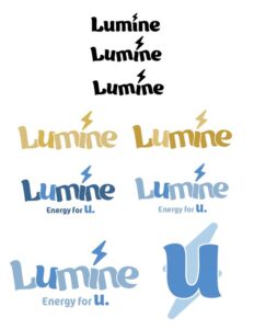
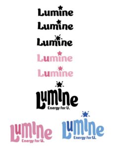
Step 1: Sketching
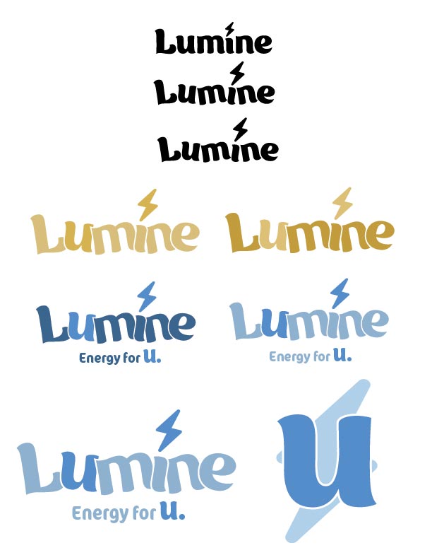
After brainstorming a heap of names for a brand new energy drink refresher, I settled on “Lumine” It sounds refreshing, bright and feminine, so I began sketching some logo ideas.
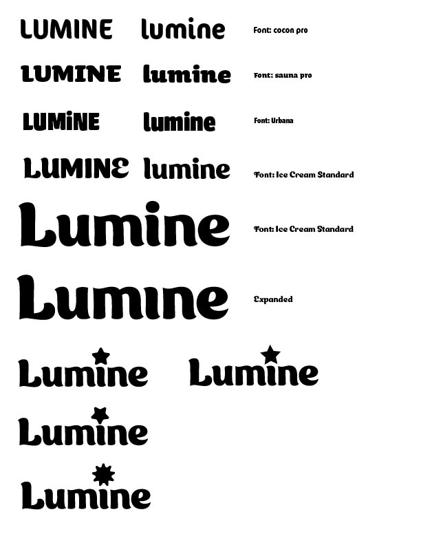
Step 2: Vectorizing


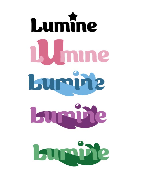


Strawberry

Orange

Grape
