Lumine Energy
Creating an Energy Drink Refresher Brand
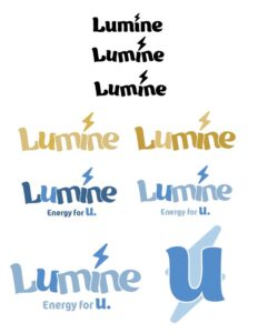
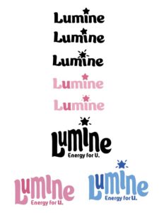
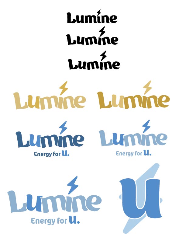
Step 1: Brainstorming & Sketching
Given the freedom to create a unique energy refresher brand, brainstorming names was the first step. The target audience for this specific energy drink refresher were active, health conscious, young women. “Lumine” was the chosen name. Next came the sketching for a logo that would speak to the target audience and resonate with them. Here, you can see some examples.
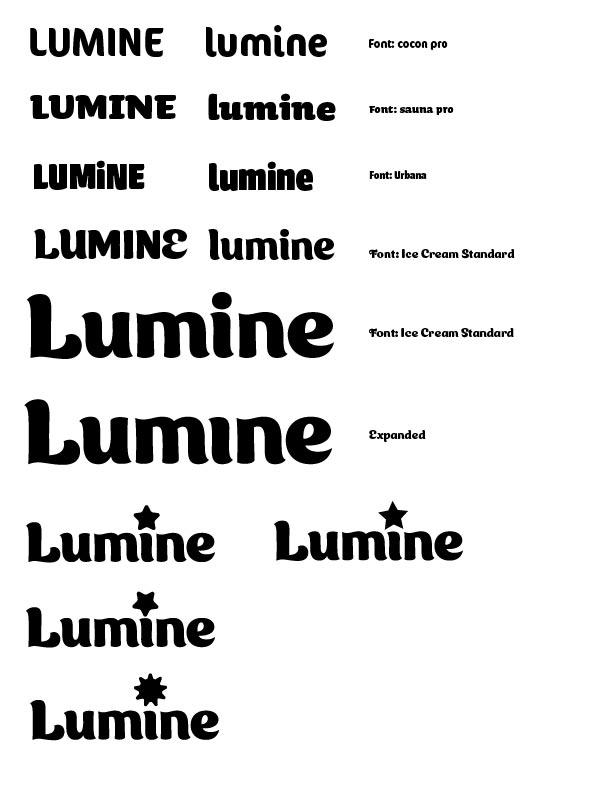
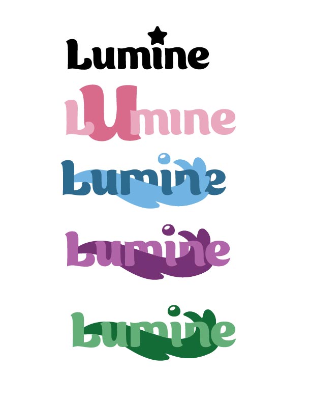
Step 2: Vectorizing
After developing some strong sketches, I moved on to bringing them to life through Adobe Illustrator. As stated previously, I knew Lumine was going to be geared towards young, active, healthy females so I picked features and colors that would align with that audience. I decided to make use of friendly, rounded, inviting typefaces such as “Ice Cream” and “Cocon Pro.” After carefully examining the logo options, I settled on the last option for the final look. The staggering of the letters adds character to the logo, the pastel color palette/options makes the brand feel feminine and more.
Click to Enlarge


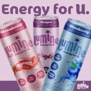
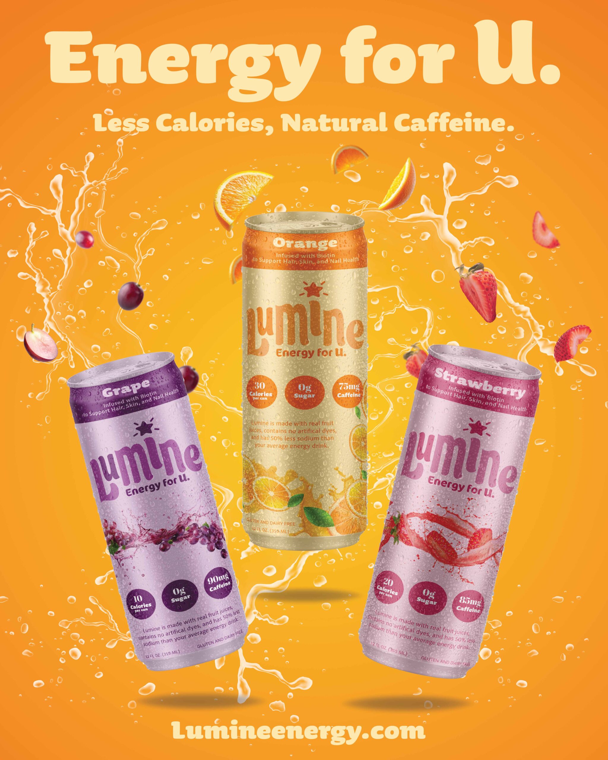
Step 3: Packaging Design
After finalizing the logo, it was time to start designing the cans that the beverage would be sold in. I decided to start with four flavors that would have the respectively colored logo with it. Take a look below.

Step 4: Brand Extension
After a successful packaging design and multiple flavor options, it was time to move on and extend Lumine beyond just the energy drink refresher can. For women on the busier side, I chose to create on-the-go pre-workout packets and four packs of the Lumine drinks.
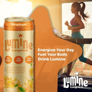
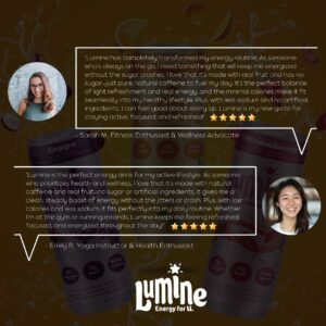
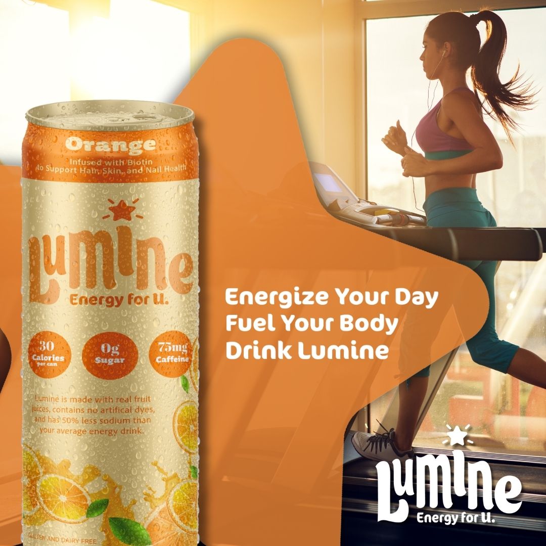
Step 5: Social Media Presence
As Lumine’s creation and branding came to an end, it was time to push a social media presence for the brand. This was done by creating a series of ads to post on instagram, one lifestyle, one product showcase and one trust building.