East Providence Logo ReBrand
Giving My Hometown a Logo-Look Makeover
Here you’ll see all of the design choices that I had to make to ensure that the logo for East Providence, Rhode Island really connected with it’s people & history.


Design Rational
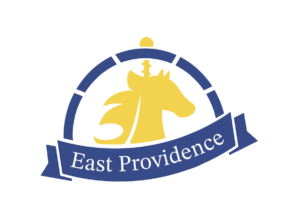
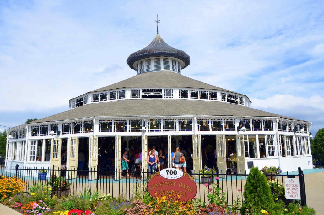
For my logo, I wanted to feature the Crescent Park Carousel due to it being deemed a historical landmark. I also wanted to incorporate the five towns within East Providence, RI (Watchemoket, Riverside, Rumford, Phillipsdale and Kent Heights). In order to feature the carousel, I created a head-shot side profile of a carousel horse as my primary logo artifact. I took advantage of the city name “East Providence” and chose to have the horse head facing East. I subtly included five curved bars around the logo to represent the five towns; something that people with a lot of knowledge of East Providence would potentially recognize. To tie the logo together, I created a curved banner that cuts into the five town blocks to hold the text for East Providence in a professional, yet decorative way.
See My Process Below

01
Round 1: Sketching
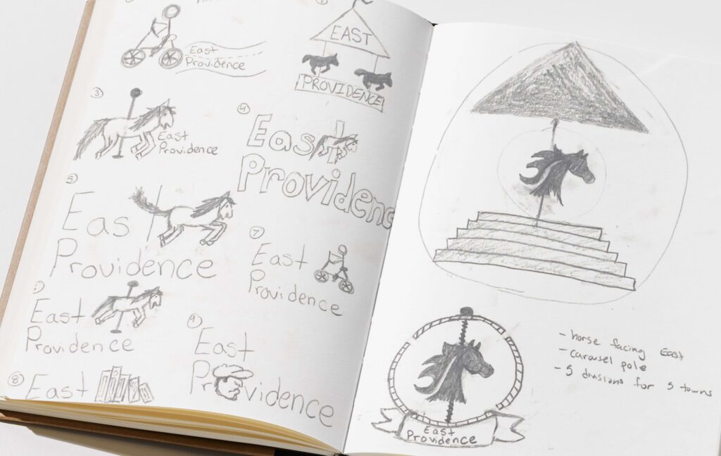
Before starting to sketch, I conducted some research about East Providence and found some stuff that I already knew– but I also found some new information such as the Crescent Park Carousel being a national landmark.
02
Round 2: Sketch Iteration
After doing some more research, I found that East Providence has five identifiable towns inside of it which are Riverside, Phillipsdale, Romford, Watchemoket, and Kent Heights. I decided to take the carousel and the five towns and incorporate those as subtly as possible into the new logo. Here, you can see the five towns represented in the steps (2nd logo) and the circle sections (1st logo)

03
Round 3: Finalizing
I decided to go with the classic circle logo look and used a banner to incorporate the city name. I also decided that I wanted to use a carousel horse head that faces towards the East to play on the name “East” Providence. I also wanted to keep the representation of the five towns with the sections in the final design.
Bringing the Sketch to Life
Take a look at the carefully considered design choices that I made throughout the process.

01
The first design features a carousel horse, five rings, a banner and a detailed carousel pole.

02
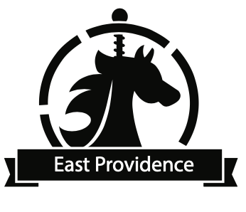
Revision #2 brings definition via negative space & introduces typography.

03
Revision #3 brings a better looking horse silhouette and more strategically placed sections to the table. It also brings with it a better looking banner & typeface combination.

04
Revision #4 introduces color. The bold red was chosen because of it’s correlation to townie pride, which is something that East Providence is known for supporting.

05
Revision #5 introduces a more toned down look to the logo, eliminating the bright gold color totally.

06
Revision #6, which is the final logo-look has a color palette of the original East Providence logo, just to tie it back to it’s history once again and not just relying on the national landmark and it’s towns.